Triptych Painting
|
|
|
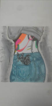
"Evolution"
(3 ft x 1 ft)
Triptych Painting
Acrylic on canvas
May 2018
(3 ft x 1 ft)
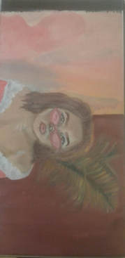
Triptych Painting
Acrylic on canvas
May 2018
Exhibition Text
In my triptych piece I wanted to explore the ways of diptych. Which is similar to triptych although is more photographic. I was inspired by two artists who are Francis Bacon and Irving Penn. In my piece I wanted to show an evolution of change of certain types of people in a situation. My first painting was showing a person with neon skin. With the second I was inspired by Penn to do a portrait of myself. And with my last artwork I was more inspired by Bacon and showed a person but tree's on top of the face to show someone with a mental disorder.
Artistic Inspiration
Irving Penn
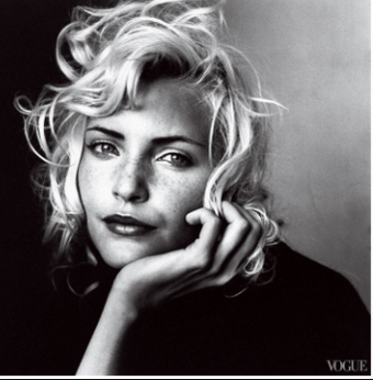
Irving Penn, Vogue Lens Magazine , portrait, 1948
|
Irving Penn was a American photography known for his fashion photography, still life's, and portraits. I was inspired by the ways of portrait photography and how they perceive people in photos. Irving Penn prefers to do black and white photos and uses that to an advantage to give more light castings onto the image. Penn was commonly in an out of vogue and contributed to the American reality. Penn’s emphasis on silhouettes, draped fabrics and dark tones results in images that cross the line between fashion and art. his shots of dresses by Issey Miyake arguably demonstrate a revived focus on the clothes’ design, but they also reveal Penn’s growing interest in movement – another evolution in the artist’s broader aesthetic. I want to use Penn's way of photography skills to show myself in Alina Baraz's music video shot for showing how people want to always be someone else besides themselves.
|
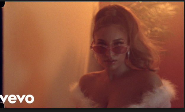
|
I found this image as I was going through photos of photography and really liked how the image was presented. So, I used it to base my second triptych painting. Although allowing myself to be put into the portrait.
|
|
Alana Baraz, picture of music video "I don't even know why though," 2018
|
Francis Bacon
|
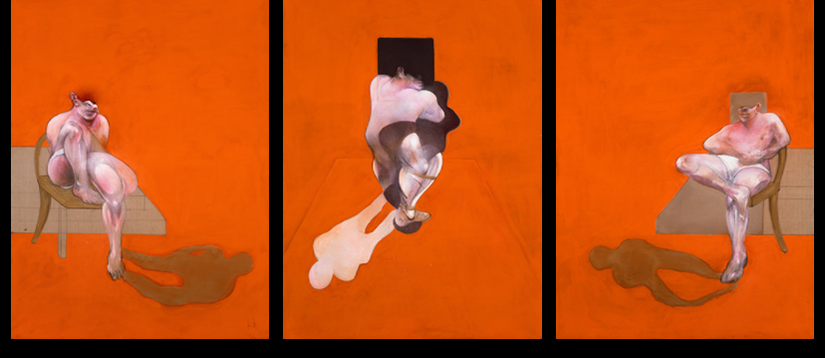
Francis Bacon was most famous for his violent and disturbing art from post-war. It is said that he had borrowed inspiration from Surrealism, film, photography, and The Old Masters. Which led him to be a very distinct artist, recognized in figurative art in 1940's and 1950's. The work established many of the themes that would occupy the rest of his career, namely humanity's capacity for self-destruction and its fate in an age of global war. In most of his work he pushed passed normal human figure pieces and made them filled with emotion for the purpose of making the viewers feel the dark emotions rather than happy. I want to use the idea of Francis Bacon concept of showing change for my idea of showing an evolution in people.
|
|
Francis Bacon,Oil, pastel and aerosol paint on canvas, Triptych: Each panel: 78 x 58 in. (198 x 147.5 cm)
|
Meaning
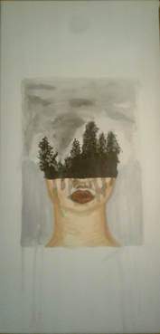
The meaning behind my triptych was to show different perspectives of human neglects. For my first canvas I did a person with their back out with the shadows neon colored. What inspired be to do this was to show how toxic some people may be. Although it isn't supposed to be a specific kind of toxic people and I was going more for just any kind of toxic people who may be toxic in relationships with a partner, family, parent and/or guardian. I was inspired by a drawing I had done previously. For my second painting I was inspired by Alana Baraz music video shot and decided to paint myself into the shot. I wanted to do this because I have found that in recent media that everyone wants to be someone else other than their selves. I wanted to make that sort of clear by not making myself look like me, but instead Alana Baraz. For my last painting I was inspired by Francis Bacon triptych painting in his piece he showed an evolution of change. With that concept i want to show that all people are going through life as if it is a process. In which my third and last piece was to show that in the end humans are growing to be a misconception to the nature of the Earth.
Process
Brainstorming
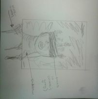
Sketch #1
|
For my first sketch I had already drawn an illustration piece for fun. So I really liked the piece enough to try and recreate the piece into a painting. Although changing this more sensation that is pretty and turning it into more dark theme.
|
Sketch #2
|
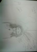
For my second painting I made a sketch for how I would look within the Alina Baraz music video shoot. Although I wanted to figure out proportion and distance for how I would paint it. Although I wasn't sure if I want the painting going vertical or horizontal. But, it made more sense and room to go horizontal.
|
Sketch #3
|
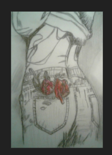
My third sketch was for my last painting, which was the painting a person with the top of the nose to head with trees in black and white. I sketched my piece to show where I wanted everything in the piece.
|
Step-by-Step of Process
|
Step #1- The first thing I did before creating my pieces was make three 3ft x 1ft canvases. With the canvas boards and the stretcher.
Step #2- After I made the canvas I put 2 to 3 coats of Gesso onto the canvas. Step #3- Once the canvases were dry I transferred my sketch onto the canvas with a pencil for all canvases. Step #4- I started each piece separately. Although it consisted of the same process of mixing my paint for things like shadows and highlights or any of my solid colors. Step #5- I layered my paints before putting in detail. When I was ready for detail I took a small round brush for getting details in the pats, eyes, and lips. Of each painting. Step #6- After I did everything in my piece I cleaned up the edges and excess backgroud with white paint to make it look professional. |
|
Skills and Techniques
While I was working on this piece I had learned how to layer certain colors in order to cover my pencil outline. I mostly did this with white paint and had to wait after each layer to dry until I felt it was solid enough to cover the pencil. I had also made washes for my two skin tone pieces of my second and third piece. In my second piece I had things like lighting and shadows that I had to think about. So, after I had my basic colors laid down I would go back in with washes to see if the color combination had made sense with each section of color. For an example, I had made several different yellows for the lighting that had came from behind me in my second piece. Although I got better results with the yellow washes I made rather than the paint mixture. Yet, I made sure that none of my colors came from straight out of the paint bottle, instead I would mix them with white or black to tone them down.
Compare and Contrast
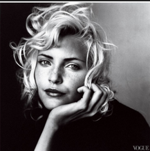
Irving Penn, Vogue Lens Magazine , portrait, 1948
|
"Evolution", Triptych painting, Lexi O'Brion, 2018
|
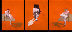
Francis Bacon,Oil, pastel and aerosol paint on canvas, Triptych: Each panel: 78 x 58 in. (198 x 147.5 cm)
|

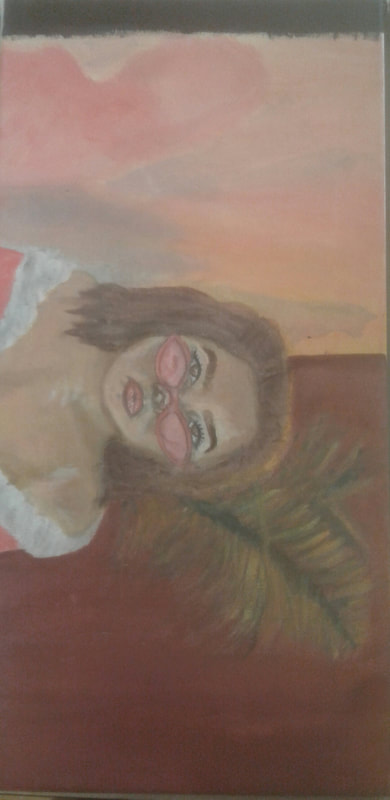
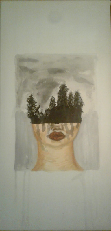
Since I had used multiple inspirations for each piece I was not fully influenced by one significant artist. Instead I took inspiration from artist Francis Bacon to show the role of change in the triptych painting he had made. Although instead of showing change directly I wanted to show the different kinds of people I had met throughout my high school years. So, in my first panel I had been inspired by my own piece that I had made outside of school to take something that looked peaceful and turning it into something more meaningful of showing toxic people. This concept had came to me when reading Haruki Murakami's short stories of "The Elephant Vanishes." I had been reading this book in my HL Literature class and felt that the author was trying to tell us readers the types of walks of life such as toxic people. In my second panel I was more inspired by ivring Penn for his photography of portraits in many magazines like vogue. I had felt that his work was very authentic and wanted to portray light versus shadow. Although I had painted myself into Alina Baraz's shot. Which empowered me to see myself in someone else. While showing definition of light and shadow. For my third panel I was inspired by diptych pieces, that are more photographic pieces. With that idea I wanted to show that humans are nature of the Earth however are dark enough that we have mental disorders, that makes us the darker part of the Earth.
Reflection
Critique
After I had finished the project I had learned how to get more defined detail in my paintings with smaller brushes. I had also made washes for each painting, which helped me with blend certain colors. Since i had already had some painting skills before hand I did not have too much trouble painting. Although I feel as if I had became more skilled in mixing colors and being able to have a variety of the same color being used throughout the piece. Layering is also something I want to keep working on because it would make my pieces that involve paint more easy to make extreme detailing.
Experimentation
|
As I was working on my pieces I did not experiment too much because what I envisioned is what I wanted to have for my triptych. Although when I was painting I changed my colors often. With my second painting i made many different colors of yellows, pinks, and purples because it was the main colors that stood out in my piece. So, I had to paint on the canvas to see if it was the right fit for the piece and if the colors did not extenuate each other I would pain over it.
|
ACT Responses
What is the overall approach ( point of view) the author has regard to the topic of your inspiration?
The point of view the author has regard to the topic of my inspiration is to inform the viewer about who the artist is and how the artwork is presented, regarding historical references.
The point of view the author has regard to the topic of my inspiration is to inform the viewer about who the artist is and how the artwork is presented, regarding historical references.
- What kind of generalizations and conclusions have you discovered about people, ideas, cultures, etc, while you researched your inspiration?
- The generalizations I have concluded about the people and ideas while I researched had been that the artists were doing with the pieces they created had been produced to influence the people in the viewing it. Which I had been strongly influenced on because of my own piece.
- What was the central idea or theme around your inspirational research?
- The central theme I had for my inspirational research was to use acrylic paint that will show my audience an interpetation piece that would make them think about the piece rather than see it for as it is.\
- What kind of inferences did you make while reading your research?
- The inferences I made while doing my research was mainly how other artists had also done some kind of relevant idea, but did a different form of theme. In which I had thought was important for my use because I needed that kind of inference to build my inspiration.
Bibliography
“IRVING PENN.” Lens Magazine, 4 Nov. 2015, lensmagazine.net/irving-penn/.
“In and Out of Vogue: Irving Penn's Fashion and Art Photography.” Apollo Magazine, 12 Apr. 2016, www.apollo-magazine.com/in-and-out-of-vogue-irving-penns-fashion-and-art-photography/.
“In and Out of Vogue: Irving Penn's Fashion and Art Photography.” Apollo Magazine, 12 Apr. 2016, www.apollo-magazine.com/in-and-out-of-vogue-irving-penns-fashion-and-art-photography/.
